top of page
Grofers
User Experience,
User Research,
User Interface
Initial Brief
To prevent drop in userbase, find problems faced by the promising userbase, & focus on building the brand niche as the best option for budget grocery shopping.
2017-18

Process

Research
First I performed a set of user testing assignments to get better understanding of the product, users; identify shortcomings and map them. I would take one of these identified shortcomings as my first assignment and see it from scratch to inferences, to ideations, to design and release.

1. Hypothesis
I started with writing a document to understand the information I had on business requirements, existing knowledge from the user data, service fall shorts, the management’s vision to finally articulate possible line of further information required
and shape research hypothesis.

The company was concerned with constant fall in repeat users and the founders wanted to tackle this with building the brand niche as the best place for cheapest grocery prices in the market. Keeping these two major information in mind I decided to check if cheap price will attract old users and retain existing users.
Following two became my focus of study, where I tried to inquire how much low prices influence users to use a platform and to find what are other factors that matter.
“We need to see how cost of items influence user’s purchase behaviour.” &
“We need to know efforts people make to keep their savings and expenses under
check while shopping groceries.”
2. Method & Prepration
I read Interviewing Users by Steve Portigal as a refresher on conducting research, while design college covers most of the aptitude as how one should conduct herself during interaction with users; the book gave me good insight onto to how I should introduce myself to the users, how I prepare scripts for interview, how I record & debrief my observations. Most importantly book gave good insight on how I chose what research method I must use.

3.Inferences
While the first round of gorilla interview gave me a fresh perspective and helped me understand that people look for various means to look for cheaper products, no single user
preferred on one method of shopping but combination of apps and markets.
While most of the users didn’t have a strict budget unlike how I thought most would have, given the Grofer’s target users were people who need strict monitoring of monthly budget given the income group. There were different factors on how users perceived a good to be expensive or not.

In the second round of interview and in-app survey, I framed specific question on frequency of purchase each month, amount and goods users spend each time, medium of spopping preferred.
These refined question lead to important insights on factors that matter for users to choose a medium of shopping, and it wasn’t just cheap price.
Discussing insights with Leadership team
& Re-defined problem statement

People don’t want cheap products; they want additional discounts to get good products for less price.
Slow Delivery ( 2-4 days), bad quality of fruits & vegetables were major cause of frustration for users, they would choose BigBasket for better delivery service even if it means to pay a little more than what they pay in Grofers, BigBasket was also preferred for good prices of dry fruits and availability of exotic food items. Local markets still offer better fruits and vegetables quality.
While the company was aware of delivery issue, solving the same would take time,
we had to work out an immideate solution.
Defined Solution
“To build the brand niche in providing good products with good discounts and additional service benefits, by paying a little extra for the service benefits”
Loyalty Programme : “The Bachat Club”
Loyalty programme was introduced to buy time and retain customer base. Time needed to work on faster delivery, thee programme made delivery under 24 hours a paid service, this lowered the expectation of faster delivery from all orders to only loyal member’s orders.
Meanwhile the lower prices for staples and key household items was an attractive sum of discount for the Grofer’s defined consumer base.
The Design
Ideation
Visual Design

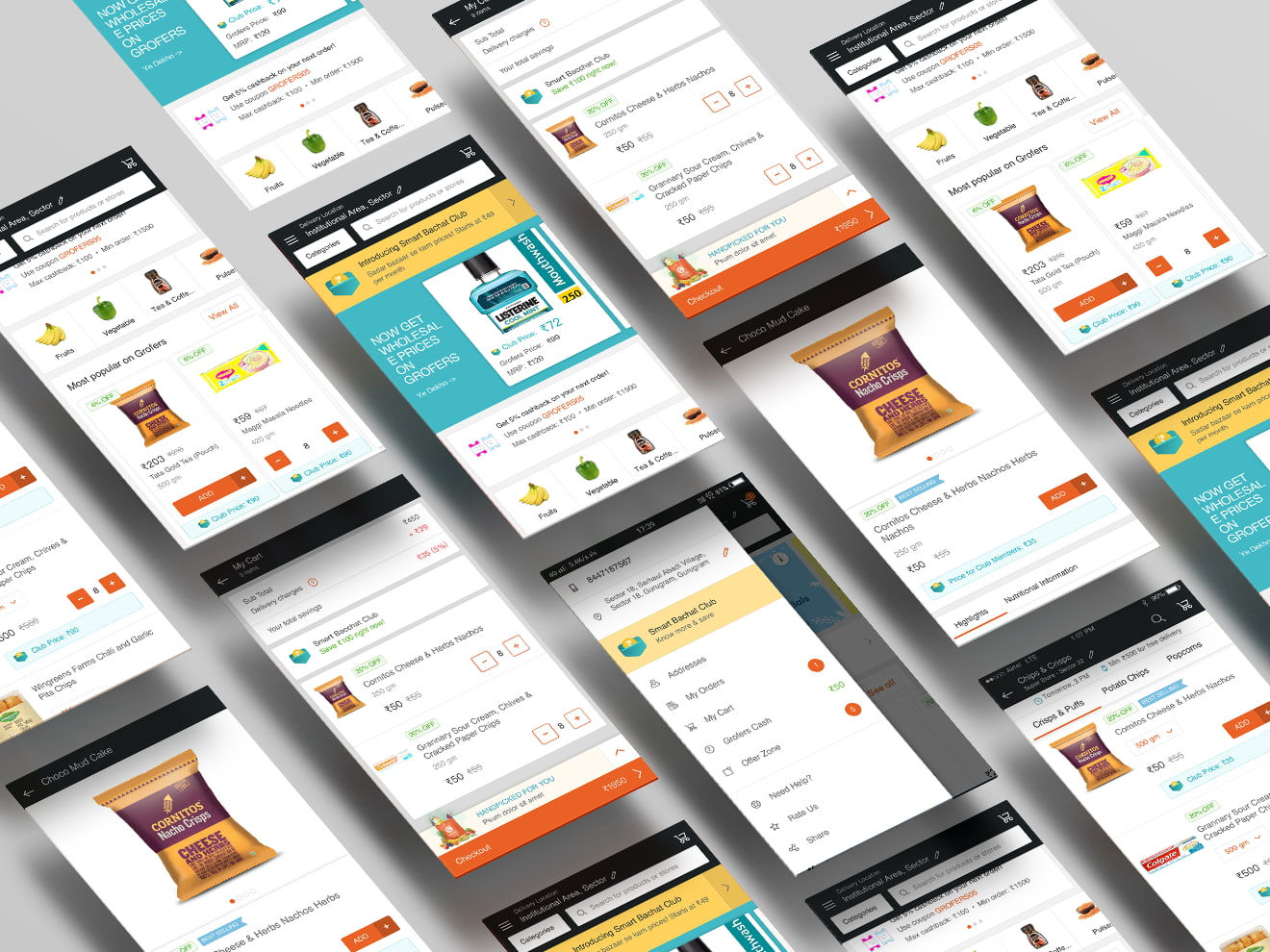
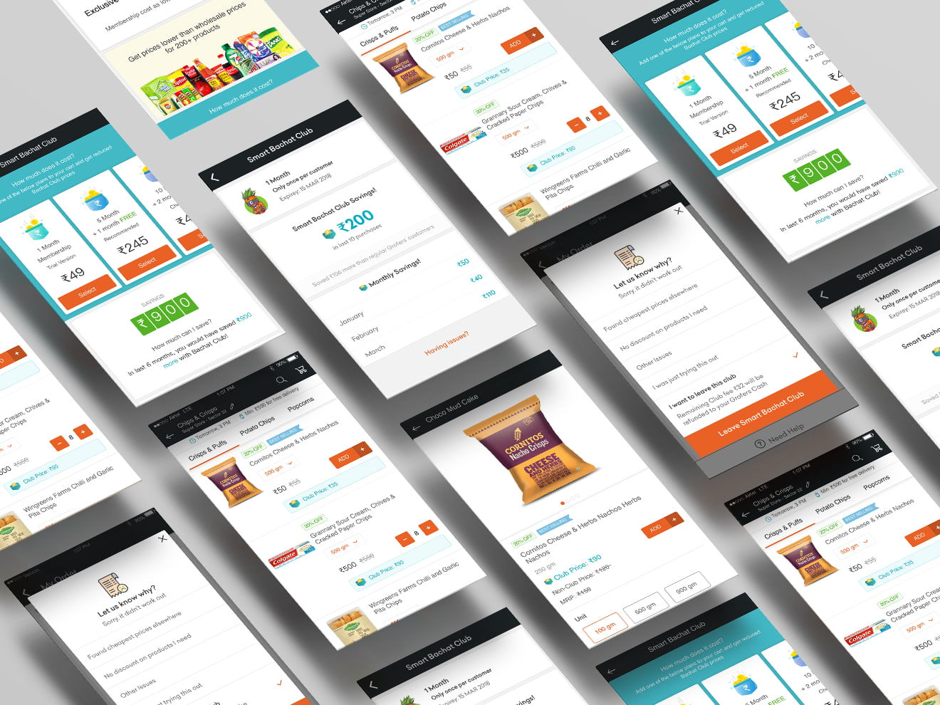
Introducing Third Colour


Card Redesign to incorporate Smart Bachat Club Prices


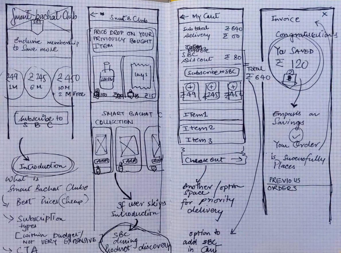
Major part for incorporating Smart Bachat Club in the existing app within short time period with very little or no change in existing UX; this required to thoughtfully think of what kind of changes to introduce and where to place them in the user journey of using the app.
I asked myself questions like, what happens if the user chooses to ignore the banner placed in home screen and continues, how will the user feel that he is missing out on Loyalty Programme benefits?
More questions like, how do I assure that subscribing should not require any new UX pattern, but should become part of existing UX pattern, that will reduce cognitive load significantly.
Illustrating below shows first draft of major UX interactions introduced for the loyalty programme from entry points to membership experience and exit if needed.

If I have to categorise these small but very important micro-interactions to be introduced at various point of shopping/browsing experience, I would categorise them into following 6 major titles.
1_Entry Points to SBC
2_Subscriptions to SBC
3_Once a Member to SBC
4_Feedback on Savings by SBC
5_Near Expiry Date of SBC
6_Exit_ Feedback and easy exit.
bottom of page